
Substantial Decorative Flowers to Elevate Your Home Decor
2026-09-20
Some rooms whisper; others hold your attention. The difference often comes down to scale—specifically, substantial decorative flowers that refuse to blend into the background. These aren't the fragile stems you rearrange every other day. They're sculptural, commanding, and surprisingly easy to live with. At PHLEEYA, we're a bit obsessed with that balance. Here's how to use oversized florals to elevate your home decor without making it feel like a showroom.
Oversized Blooms That Anchor a Room
A single oversized bloom arrangement can shift the feel of a room faster than most furniture swaps. Think of a giant branch of cherry blossoms in a wide-mouth stoneware vase on a dining table, or three enormous peonies leaning out of a ceramic pitcher on a console. The scale does something unexpected: it pulls the eye downward then upward, creating a sense of calm without making the space feel staged. You don't need a dozen stems; one or two dramatic flowers force the room to slow down.
The trick is choosing blooms with enough presence to hold their own against the room's architecture. Oversized dahlias, king protea, or full-blown garden roses work well, especially when paired with sparse greenery or nothing at all. Place them where they can interrupt a long sightline—a foyer, the end of a hallway, a shelf with too much symmetry. The arrangement becomes a soft anchor, a pause point that makes the surrounding pieces feel more intentional.
Avoid fussy vases. Let the stem's natural curve or a slightly imperfect container do the talking. The goal isn't a wedding centerpiece; it's an everyday object that carries the weight of the room without shouting.
Layering Textures with Faux Botanicals
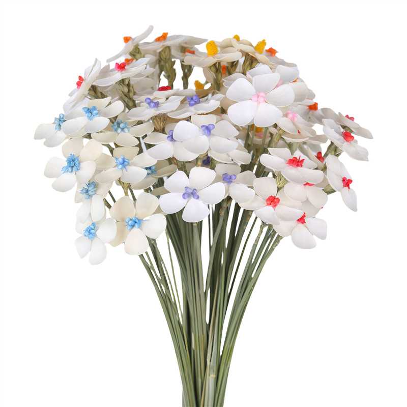
A single faux stem rarely carries a vignette on its own. The real movement comes from what sits behind and beneath it—a nubby linen runner under a cluster of papery lamb's ear, or a ribbed glass vase catching light next to velvet-tipped artichoke stems.
Pair glossy faux leaves with open-weave baskets or unglazed terracotta. The eye needs friction. A spiky faux grass loses its plastic sheen when placed against a rough plaster wall, while a rounded fiddle-leaf fig reads more believable beside a slubbed cotton throw.
Don't stop at foliage. Layer in faux branches, dried seed pods, or even a single preserved palm frond tucked behind a stack of books. Keep the palette tight—two greens, one neutral, a hint of rust or ochre—so the textures do the talking instead of a rainbow of plastic.
Sculptural Stems as Standalone Art
A stem without a bloom is not a loss but a different kind of presence. Its line can curve with a confidence that flowers often distract from, turning empty space into a deliberate part of the composition. The eye follows the stalk's angle, the slight swell at a node, the way it leans toward or away from the light. What remains is shape and posture, stripped to essentials.
Some stems carry their own texture as the main event—ridged, mottled, glossy, or matte. They catch shadow in ways that soft petals cannot, making a quiet case for restraint. A single branch in a narrow vase can hold a corner of a room, not by filling it, but by giving the emptiness around it a reason to be noticed.
Grouping two or three stems together often works like a line drawing in three dimensions. Their heights and intersections create negative space that shifts as you move past. No two arrangements settle the same way, because each stem keeps its own memory of growth. That is the appeal: the art is not in the flower, but in the gesture of the stem itself.
Color Blocking with Bold Petals
Pairing saturated, solid panels with oversized floral prints creates a tension that feels both graphic and organic. The trick is to let one element dominate—either the color blocks frame the petals or the petals interrupt the blocks—so the eye understands the hierarchy. Think cobalt blue sleeves against a vermilion bodice scattered with hand-painted peonies, or a skirt split between lemon yellow and magenta with a single oversized rose crossing the seam.
Scale matters more than matching. A common mistake is choosing timid blooms that get lost against strong color fields. Instead, opt for petals that are exaggerated almost to abstraction; their curves should echo the angles of the blocks, not fight them. Use one or two shared accent colors between the floral motif and the color blocks to create a quiet bridge—like pulling the exact shade of a petal's center into a hemline stripe.
Balance this look by keeping accessories and makeup minimal. The clothes are already having a conversation with themselves; adding a third voice turns it into noise. A neutral shoe, bare neck, and clean hair let the color blocks and petals do the work.
Unexpected Vessels for Statement Arrangements
A claw-foot bathtub filled with trailing ivy and eucalyptus turns a forgotten corner into an indoor garden. The cast iron curves and worn enamel bring a soft, uneven texture that no glossy ceramic pot can match. For a dinner party, try lining an old wooden canoe with moss and clusters of white cosmos—the contrast between weathered wood and delicate petals draws the eye without trying too hard.
Vintage tackle boxes and tool chests work surprisingly well for herb gardens or small fern collections. Open the drawers at different angles, let soil spill over the edges, and suddenly the piece feels lived-in rather than staged. A hollowed-out bread box or an antique birdcage can hold dried grasses and single stems, creating height on a sideboard without the usual vase shape.
Don't overlook the kitchen. Enamel colanders with rust spots make charming hanging planters, and a stack of mismatched teacups can host succulents along a windowsill. The key is to let the vessel's history show—chipped paint, faded labels, and bent metal all add character that a brand-new container simply can't fake.
Living-Like Details That Fool the Eye
The trick isn't copying nature perfectly—it's copying its small failures. That faux olive branch on the shelf looks real because one leaf curls a little too sharply, while another has a faint brown edge no manufacturer would intentionally print. A cast-resin pear gains credibility from a bruise-like blush near the stem, and a ceramic birdbath wears a hairline crack that suggests winters survived. These tiny, almost accidental flaws give the eye something to believe in, because perfection reads as plastic before it reads as alive.
Materials matter more than shape. A silk orchid stops being a silk orchid when its lowest bloom droops and fades to a tired mauve, and when the pot's rim carries a faint watermark left by hard water. Hand-painted veins on a fabric leaf need a matte finish next to a single glossy highlight, not an even sheen. Even a plaster bust of a Roman emperor fools the hand before the eye when its earlobe has a small chip and dust has settled into the carved hair. The living-like effect comes from wear, not wow.
FAQ
Scale, repetition, and layering all play a role. Choose blooms with large heads like peonies, hydrangeas, or ranunculus, and cluster them tightly so they read as one bold mass rather than scattered stems. Adding foliage with varied textures, such as eucalyptus or ferns, fills gaps and creates a lush, grounded presence.
Look for a vessel with a wide opening and a heavy base to support the visual weight. Ceramic, stoneware, or thick glass works well; avoid slender necks that force stems into a tight upright line. The vase height should be roughly one-third to one-half the total arrangement height, so the flowers remain the focal point without toppling.
Absolutely. High-quality faux stems with realistic petals and wired leaves blend surprisingly well with fresh ones. Place fresh blooms where they will be noticed up close, and use artificial filler like silk greenery or dried grasses toward the back or center to add volume without extra maintenance.
Think about sightlines. An entryway console, a dining table centerpiece, or a fireplace mantel are natural stages. For a more unexpected move, place a large arrangement on a low side table in a corner that feels empty, or on a kitchen island where it can be enjoyed from multiple angles without blocking conversation.
Trim stems at a sharp angle every two days and change the water completely rather than just topping it off. Remove any leaves that sit below the waterline, and keep the arrangement away from direct sunlight, heating vents, and ripening fruit. For artificial stems, a gentle wipe with a damp cloth and occasional dusting keeps them vivid.
Instead of matching exactly, try monochromatic layers in one hue with different depths, like blush, coral, and deep rose. Or pair analogous colors such as lavender, blue, and soft green for a calm, high-end look. If you crave contrast, lean into a single bold accent color against creamy neutrals—avoid using more than three dominant tones in one arrangement.
Yes. Hydrangeas, peonies, garden roses, dahlias, and chrysanthemums have full, rounded heads that fill space quickly. For height and architecture, add branches like curly willow, pussy willow, or cherry blossom. Tropical options such as protea, anthurium, and birds of paradise bring bold structure and a sculptural feel.
Start with a base of greenery in varying lengths to create an airy framework. Then insert the largest blooms first at the center and lower edges, and work outward with smaller stems. Angle some stems slightly outward rather than straight up, and leave intentional negative space between clusters so the eye can rest—volume comes from rhythm, not overcrowding.
Conclusion
There’s a quiet confidence that comes from placing a single oversized bloom where a cluster of small stems once sat. Substantial decorative flowers do more than fill a corner—they anchor the entire visual weight of a room, pulling furniture arrangements and sightlines toward them with ease. The trick isn’t just scale; it’s how you layer. Faux botanicals, when chosen for their varied textures—glossy leaves against matte petals, nubby stems beside smooth silk—create a depth that feels curated rather than manufactured. And some stems are so structural, so deliberately shaped, that they need no companions at all. A sculptural branch in a low-profile plinth becomes a piece of standing art, changing with the light and the angle of the room, not unlike a bronze cast or a carved stone.
Color, too, plays a louder role when petals are bold. Blocking a deep crimson against an acid yellow or a chalky blush against forest green turns a simple arrangement into a deliberate composition, almost like painting a wall with living pigment. The vessel matters just as much—a vintage copper kettle, a shallow ceramic bowl, or even a repurposed glass cloche can shift the entire mood. What makes these substantial arrangements truly sing, however, is the near-imperceptible detail: veins pressed into a leaf, a slight irregularity along a petal’s edge, a color gradient that mimics a real bloom catching the sun. These living-like touches fool the eye just enough to blur the line between the natural and the crafted, which is exactly where elevated home decor begins.
Contact Us
Contact Person: Mr. Luo
Email: [email protected]
Tel/WhatsApp: 86 18100895505
Website: https://www.feiliyaflowers.com/en/